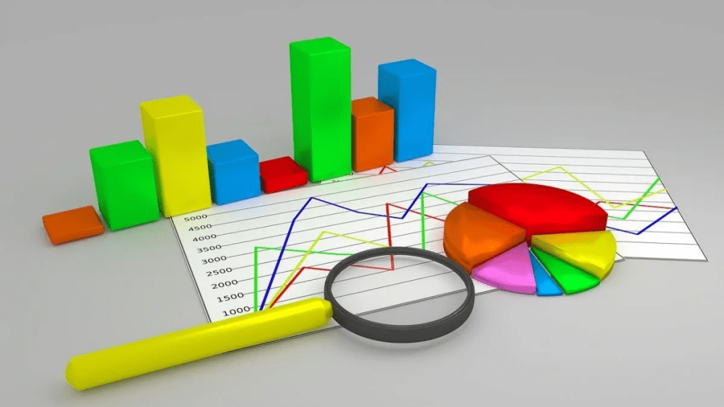
A chart is used to represent the data graphically. Charts are often used to ease understanding of large quantities of data and the relationships between parts of the data. Charts can usually be read more quickly than the raw data.

| Purpose of the chart | Type of chart to use |
|---|---|
| Show trends over time. | Column chart, line chart, point chart |
| Compare data. | Bar chart, column chart |
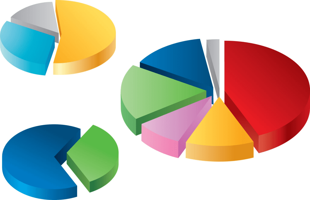
| Show the relationship of parts to the whole or highlight proportions. | Pie chart |
| Show the parts that contribute to the total and compare change over time. | Stacked column chart |
| Show groups of related data. | Bar chart, column chart |
| Emphasize the magnitude of change over time. | Area chart |
| Show the relationship between two measures. | Scatter chart |
| Show the relationships between three measures. | Bubble chart |
| Show trends over time or compare data with two measures. | Combination chart |
| Identify patterns of high and low values. | Tree map |
Component of Chart

In Microsoft Excel, you can create a chart to visually represent the information from the paragraph. Here are the components you can include in an Excel chart based on the provided paragraph:
- X-axis categories:
- Mahatma Buddha’s teachings and their impact on agriculture.
- Jainism’s emphasis on agriculture and non-violence.
- Y-axis values:
- Increase in agricultural productivity and its impact on economic and social life.
- Development of cities and new businesses due to agricultural growth.
- Creation of new social classes and the need for a strong governing class.
- Changes in societal values and traditions due to economic progress.
- Chart types:
- Bar chart: To compare the impact of Mahatma Buddha’s teachings and Jainism on agriculture, economic development, and societal changes.
- Line chart: To show the growth and development trends in agricultural productivity, urbanization, and social classes over time.
- Pie chart: To represent the distribution of societal classes or the proportion of different factors contributing to economic progress.
- Chart titles and labels:
- Main title: “Impact of Mahatma Buddha’s Teachings and Jainism on Agriculture and Society”
- X-axis label: “Teachings and Influence”
- Y-axis label: “Effects and Changes”
- Data series labels: “Agricultural Growth,” “Urban Development,” “Social Classes,” etc.
- Legend:
- To differentiate between different elements or factors represented in the chart.
- Gridlines and axes:
- To provide a visual reference for data points and their values.
Characteristics of a Good Chart in Excel
The goal of a chart in Excel is to get the information displayed in a way that everyone can understand. It allows to interpret reports and analyze complex data easily.
In this sense, the characteristics of a good graph in Excel are:
- Visually explain the values or data that we want to analyze.
- It should be self-explanatory and easy to understand.
- The graph’s content should be explained through legends.
- It should be immaculate, without elements or colors that generate distractions.
Column Chart
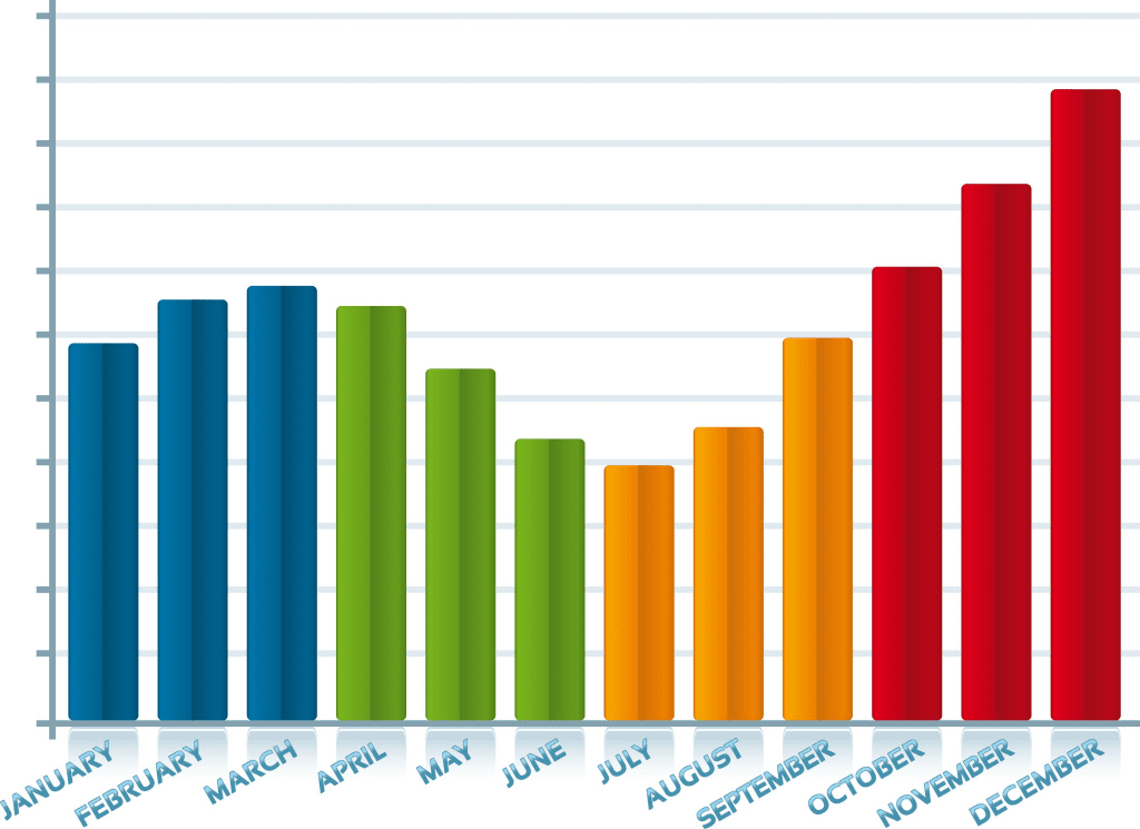
A Column Chart typically displays the categories along the horizontal (category) axis and values along the vertical (value) axis. To create a column chart, arrange the data in columns or rows on the worksheet.
A column chart has the following sub-types −
- Clustered Column.
- Stacked Column.
- 100% Stacked Column.
- 3-D Clustered Column.
- 3-D Stacked Column.
- 3-D 100% Stacked Column.
- 3-D Column.
Line Chart
Line charts can show continuous data over time on an evenly scaled Axis. Therefore, they are ideal for showing trends in data at equal intervals, such as months, quarters or years.
In a Line chart −
- Category data is distributed evenly along the horizontal axis.
- Value data is distributed evenly along the vertical axis.
To create a Line chart, arrange the data in columns or rows on the worksheet.
A Line chart has the following sub-types −
- Line
- Stacked Line
- 100% Stacked Line
- Line with Markers
- Stacked Line with Markers
- 100% Stacked Line with Markers
- 3-D Line
Pie Chart

Pie charts show the size of items in one data series, proportional to the sum of the items. The data points in a pie chart are shown as a percentage of the whole pie. To create a Pie Chart, arrange the data in one column or row on the worksheet.
A Pie Chart has the following sub-types −
- Pie
- 3-D Pie
- Pie of Pie
- Bar of Pie
Doughnut Chart
A Doughnut chart shows the relationship of parts to a whole. It is similar to a Pie Chart with the only difference that a Doughnut Chart can contain more than one data series, whereas, a Pie Chart can contain only one data series.
A Doughnut Chart contains rings and each ring representing one data series. To create a Doughnut Chart, arrange the data in columns or rows on a worksheet.
Bar Chart

Bar Charts illustrate comparisons among individual items. In a Bar Chart, the categories are organized along the vertical axis and the values are organized along the horizontal axis. To create a Bar Chart, arrange the data in columns or rows on the Worksheet.
A Bar Chart has the following sub-types −
- Clustered Bar
- Stacked Bar
- 100% Stacked Bar
- 3-D Clustered Bar
- 3-D Stacked Bar
- 3-D 100% Stacked Bar
Area Chart
Area Charts can be used to plot the change over time and draw attention to the total value across a trend. By showing the sum of the plotted values, an area chart also shows the relationship of parts to a whole. To create an Area Chart, arrange the data in columns or rows on the worksheet.
An Area Chart has the following sub-types −
- Area
- Stacked Area
- 100% Stacked Area
- 3-D Area
- 3-D Stacked Area
- 3-D 100% Stacked Area
XY (Scatter) Chart
XY (Scatter) charts are typically used for showing and comparing numeric values, like scientific, statistical, and engineering data.
A Scatter chart has two Value Axes −
- Horizontal (x) Value Axis
- Vertical (y) Value Axis
It combines x and y values into single data points and displays them in irregular intervals, or clusters. To create a Scatter chart, arrange the data in columns and rows on the worksheet.
Place the x values in one row or column, and then enter the corresponding y values in the adjacent rows or columns.
Consider using a Scatter chart when −
- You want to change the scale of the horizontal axis.
- You want to make that axis a logarithmic scale.
- Values for horizontal axis are not evenly spaced.
- There are many data points on the horizontal axis.
- You want to adjust the independent axis scales of a scatter chart to reveal more information about data that includes pairs or grouped sets of values.
- You want to show similarities between large sets of data instead of differences between data points.
- You want to compare many data points regardless of the time.
- The more data that you include in a scatter chart, the better the comparisons you can make.
A Scatter chart has the following sub-types −
- Scatter
- Scatter with Smooth Lines and Markers
- Scatter with Smooth Lines
- Scatter with Straight Lines and Markers
- Scatter with Straight Lines
Bubble Chart

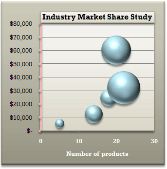
A Bubble chart is like a Scatter chart with an additional third column to specify the size of the bubbles it shows to represent the data points in the data series.
A Bubble chart has the following sub-types −
- Bubble
- Bubble with 3-D effect
Stock Chart
As the name implies, Stock charts can show fluctuations in stock prices. However, a Stock chart can also be used to show fluctuations in other data, such as daily rainfall or annual temperatures.
To create a Stock chart, arrange the data in columns or rows in a specific order on the worksheet. For example, to create a simple high-low-close Stock chart, arrange your data with High, Low, and Close entered as Column headings, in that order.
A Stock chart has the following sub-types −
- High-Low-Close
- Open-High-Low-Close
- Volume-High-Low-Close
- Volume-Open-High-Low-Close
Surface Chart
A Surface chart is useful when you want to find the optimum combinations between two sets of data. As in a topographic map, colors and patterns indicate areas that are in the same range of values.
To create a Surface chart −
- Ensure that both the categories and the data series are numeric values.
- Arrange the data in columns or rows on the worksheet.
A Surface chart has the following sub-types −
- 3-D Surface
- Wireframe 3-D Surface
- Contour
- Wireframe Contour
Radar Chart
Radar charts compare the aggregate values of several data series. To create a Radar chart, arrange the data in columns or rows on the worksheet.
A Radar chart has the following sub-types −
- Radar
- Radar with Markers
- Filled Radar
Combo Chart
Combo charts combine two or more chart types to make the data easy to understand, especially when the data is widely varied. It is shown with a secondary axis and is even easier to read. To create a Combo chart, arrange the data in columns and rows on the worksheet.
A Combo chart has the following sub-types −
- Clustered Column – Line
- Clustered Column – Line on Secondary Axis
- Stacked Area – Clustered Column
- Custom Combination
Treemap Chart
Treemap Chart Used to show hierarchical data. The data is displayed as a set of rectangles, with the size of each rectangle proportional to the data value.
A Treemap chart has the following sub-types −
- Treemap,
- Squarified Treemap,
- TreeMap with Color Scales,
- TreeMap with Hierarchical Levels
Waterfall Chart
Waterfall Chart Used to show how an initial value is affected by intermediate positive or negative values, resulting in a final value.
A Waterfall chart has the following sub-types −
- Waterfall,
- Stacked Waterfall
Funnel Chart
Funnel Chart Used to show the different stages in a process, with each stage represented as a proportion of the previous stage.
A Waterfall chart has the following sub-types −
- Funnel ,
- Stacked Funnel
Histogram Chart
Histogram Chart Used to show the frequency distribution of a data set. The data is displayed as a series of bars.
A Histogram chart has the following sub-types −
- Histogram,
- Pareto
Box and Whisker Chart
Box and Whisker Chart Used to show the distribution of a data set. The chart displays the minimum, maximum, median, and quartile values.
A Box and Whisker chart has the following sub-types −
- Box and Whisker
How to use Important chart
- Column Chart:
- Enter your data in a worksheet.
- Select the data range you want to use for your chart.
- Click on the “Insert” tab at the top of the Excel window.
- Click on the “Column” chart icon in the “Charts” section.
- Choose the subtype of the column chart that you want to create.
- Your chart will appear on the worksheet. You can customize it using the “Chart Tools” options on the ribbon.
- Pie Chart:
- Enter your data in a worksheet.
- Select the data range you want to use for your chart.
- Click on the “Insert” tab at the top of the Excel window.
- Click on the “Pie” chart icon in the “Charts” section.
- Choose the subtype of the pie chart that you want to create.
- Your chart will appear on the worksheet. You can customize it using the “Chart Tools” options on the ribbon.
- Line Chart:
- Enter your data in a worksheet.
- Select the data range you want to use for your chart.
- Click on the “Insert” tab at the top of the Excel window.
- Click on the “Line” chart icon in the “Charts” section.
- Choose the subtype of the line chart that you want to create.
- Your chart will appear on the worksheet. You can customize it using the “Chart Tools” options on the ribbon.
- Scatter Chart:
- Enter your data in a worksheet.
- Select the data range you want to use for your chart.
- Click on the “Insert” tab at the top of the Excel window.
- Click on the “Scatter” chart icon in the “Charts” section.
- Choose the subtype of the scatter chart that you want to create.
- Your chart will appear on the worksheet. You can customize it using the “Chart Tools” options on the ribbon.
These are just some of the basic steps to create the chart types in Microsoft Excel. The exact steps may vary depending on your version of Excel and the specific chart type you want to create.
Rest of chart
- Doughnut Chart: Select your data range, go to the Insert tab, and click on Doughnut chart. Choose the desired chart style.
- Area Chart: Select your data range, go to the Insert tab, and click on Area chart. Choose the desired chart style.
- Bubble Chart: Select your data range, go to the Insert tab, and click on Bubble chart. Choose the desired chart style.
- Stock Chart: Select your data range, go to the Insert tab, and click on Stock chart. Choose the desired chart style.
- Radar Chart: Select your data range, go to the Insert tab, and click on Radar chart. Choose the desired chart style.
- Surface Chart: Select your data range, go to the Insert tab, and click on Surface chart. Choose the desired chart style.
- Treemap Chart: Select your data range, go to the Insert tab, and click on Treemap chart. Choose the desired chart style.
- Waterfall Chart: Select your data range, go to the Insert tab, and click on Waterfall chart. Choose the desired chart style.
- Funnel Chart: Select your data range, go to the Insert tab, and click on Funnel chart. Choose the desired chart style.
- Histogram Chart: Select your data range, go to the Insert tab, and click on Histogram chart. Choose the desired chart style.
- Box and Whisker Chart: Select your data range, go to the Insert tab, and click on Box and Whisk
Chart Tool
 Chart Objects: When a chart is activated, the name of the selected chart element is displayed in this control. In addition, you can select a particular chart element by using the drop-down list.
 Format Selected Object: Displays the Format dialog box for the selected chart element.
 Chart Type: Expands to display 18 chart types when you click the arrow. After this tool is expanded, you can drag it to a new location-creating, in effect, a miniature floating toolbar.
 Legend: Toggles the legend display in the active chart.
 Data Table: Toggles the display of the data table in a chart.
 By Row: Plots the data by rows.
 By Column: Plots the data by columns.
 Angle Clockwise: Displays the selected text at a -45-degree angle.
 Angle Counterclockwise: Displays the selected text at a +45-degree angle.
The Angle tools are toggles. Click a second time and Excel no longer angles the selected text.
In addition, several tools on the other toolbars work with charts, including the Fill Color, Font Color, Bold, Italic, and Font tools.
Excel includes several other chart-related tools that aren’t on the Chart toolbar. You can customize the toolbar to include these additional tools. To customize your Chart toolbar:
1. Make sure the Chart toolbar is displayed.
2. Choose View -> Toolbars -> Customize to display the Customize dialog box.
3. Select the Commands tab.
4. Choose the Charting from the Categories list box.
5. Click an item in the Commands list and drag it to your Chart toolbar.
6. Repeat Step 5 for other commands that you’d like to add.
7. Click Close to close the Customize dialog box.
Computer – KnowledgeSthali
See this also –
- MS Excel
- Supercomputer
- HTML’s Positive Potential: Empower Your Web Journey|1980 – Present
- The World of Microcomputer (1971-Today)
- Photoshop: A graphics editing software
- ब्रिटिश ईस्ट इंडिया कंपनी के अधिनियम
- भारत में स्थानीय नगरीय प्रशासन | संरचना, विकास और विशेषताएं
- भारत में पंचायती राज व्यवस्था प्रणाली | संरचना एवं विशेषताएं
- संख्याएँ | Numbers
- युग्म-शब्द | 500 +| उच्चारण में समान अर्थ में भिन्न

